Branding case study
The Omni Collective
Branding for the NIQ for Digital Commerce podcast. It had to complement the main brand but look completely separate from it.
- Client
- NIQ for Digital Commerce
- Year
- 2023
- Role
- Brand designer
- Tools
- Figma
The brief
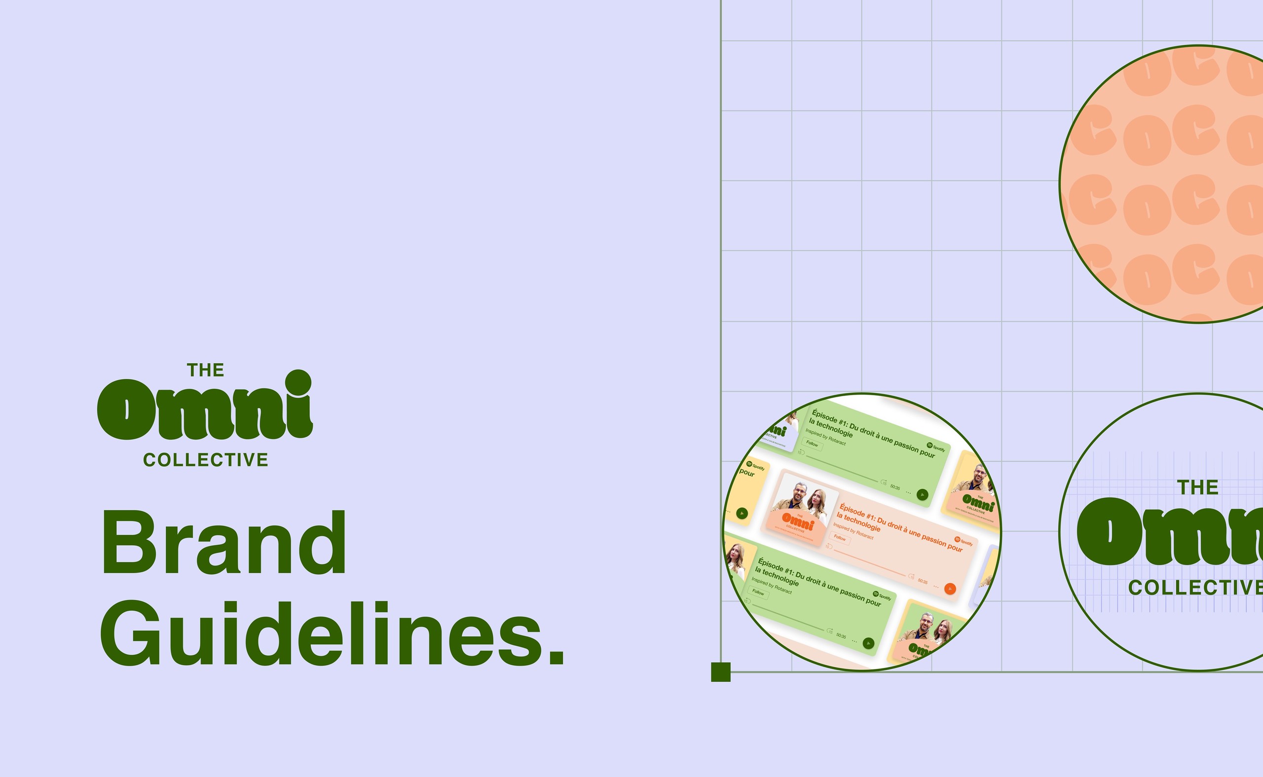
NIQ for Digital Commerce wanted its podcast to have its own identity. A separate brand would make the posts feel less corporate and less like sponsored content, which encourages more organic interaction.
Competitor podcasts looked dry and very standard. The goal was something that would pop out from the rest.
01
Finding the logo
Iterations
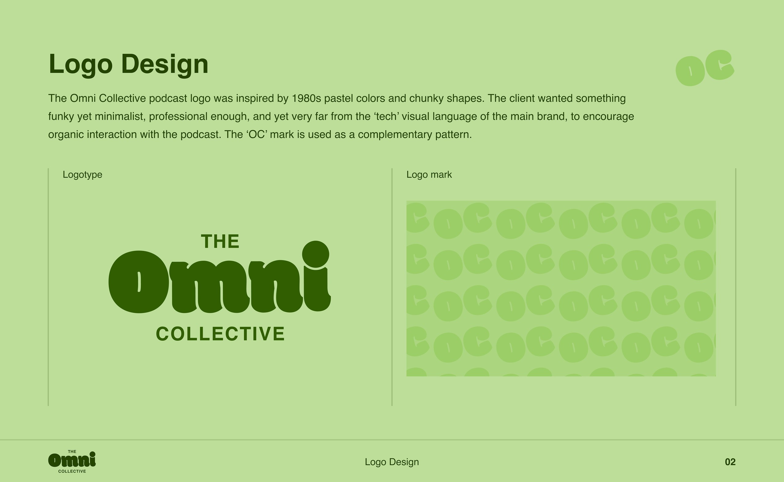
The brief was open-ended, so I went through several rounds. Each early version was turned down for feeling too corporate. The long name made it hard to fit everything into one logotype.
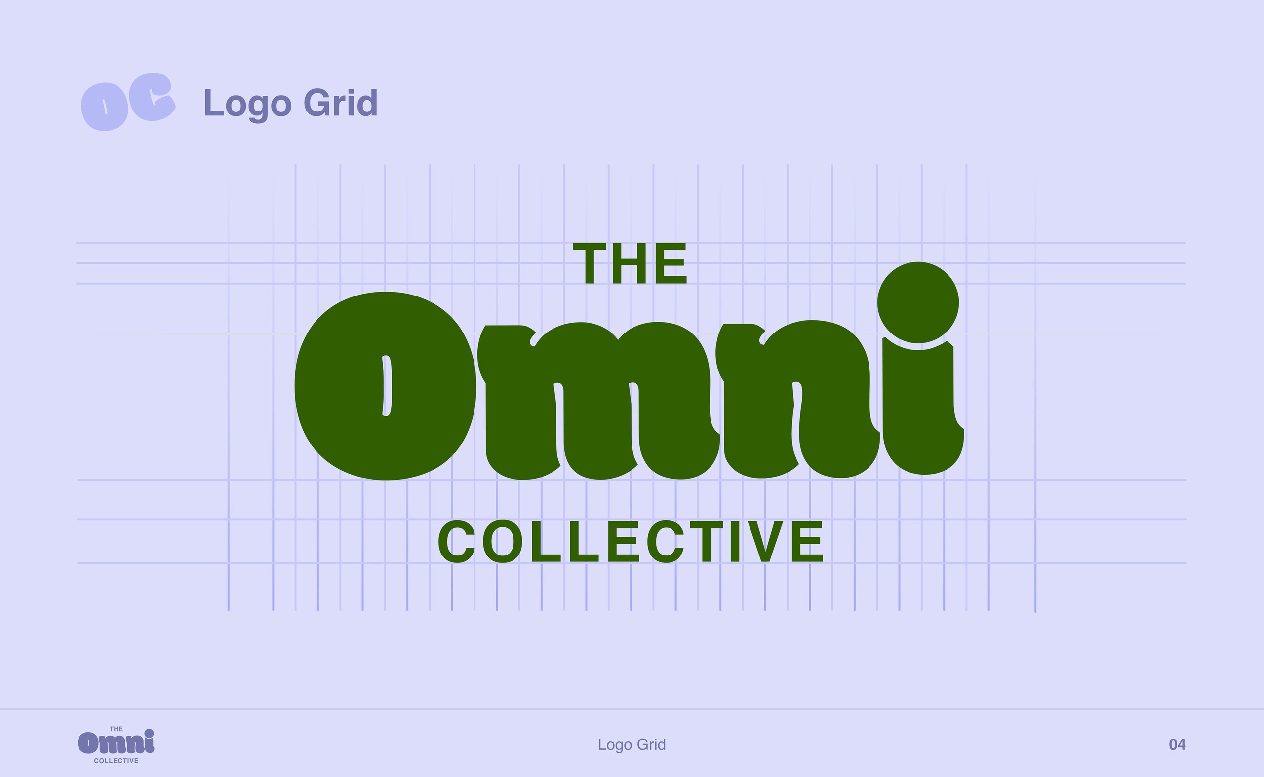
I ended up using a funky, original font for “Omni” and a minimal sans serif for the rest. The “OC” mark doubles as a playful repeating pattern.
02
Colour & type
Palette & fonts
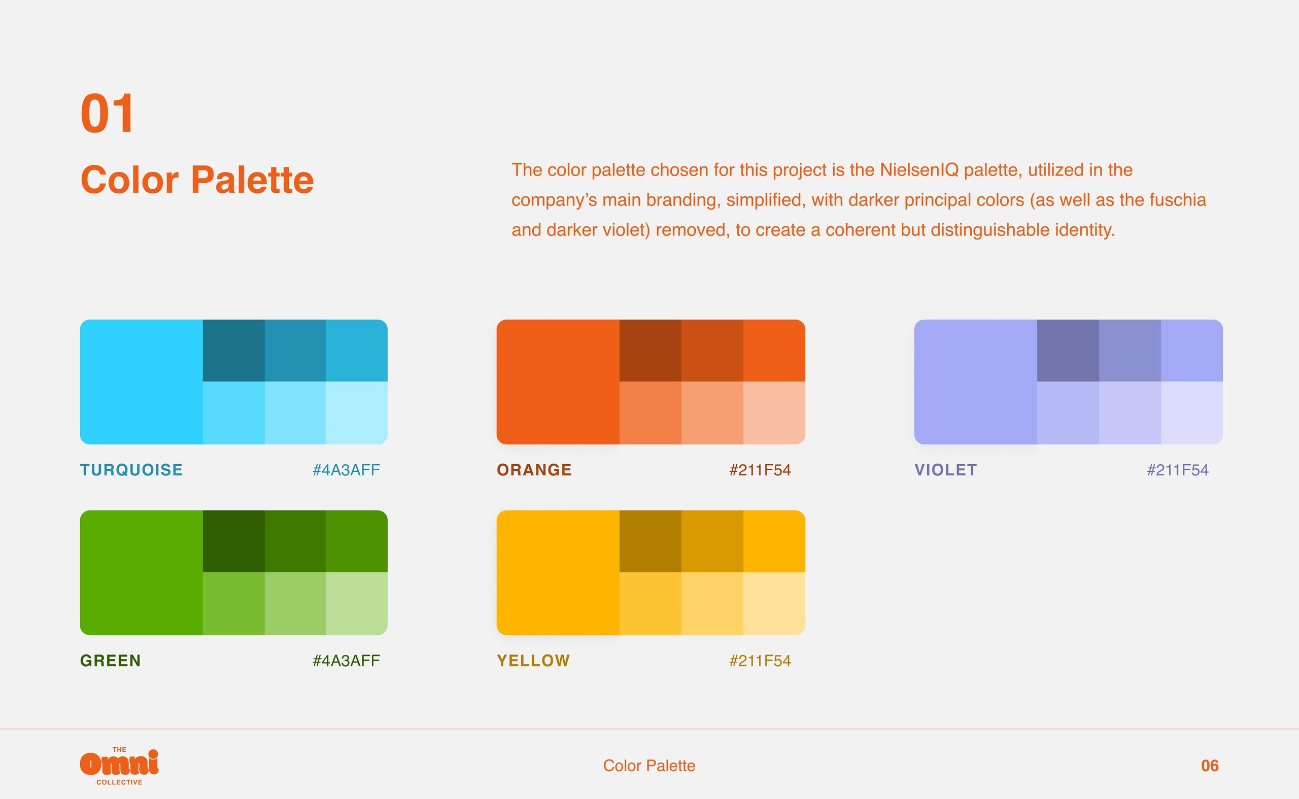
The palette is a simplified version of NIQ's, with the darker main colours removed. It stays coherent with the parent brand while feeling clearly different.
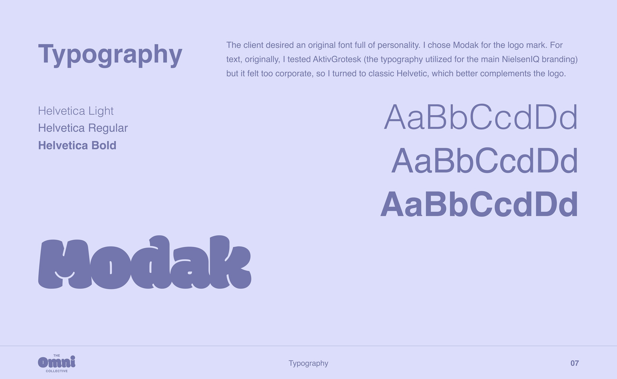
Modak gives the logo its personality. For text, I first tested Aktiv Grotesk from the main brand, but it felt too corporate, so I switched to classic Helvetica, which sits better beside the logo.
03
In use
Templates
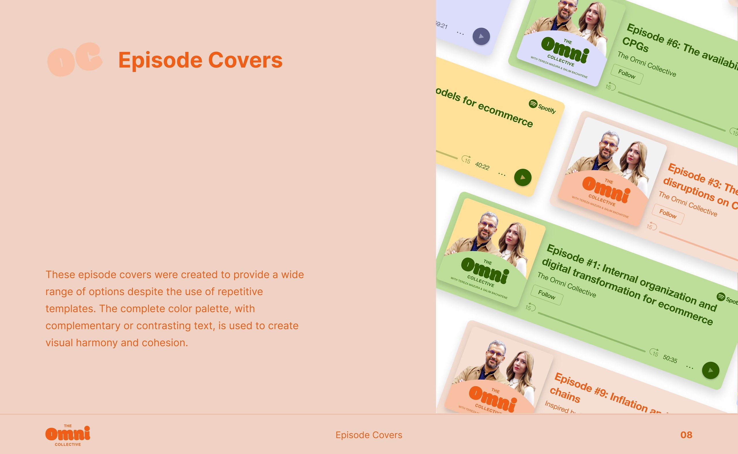
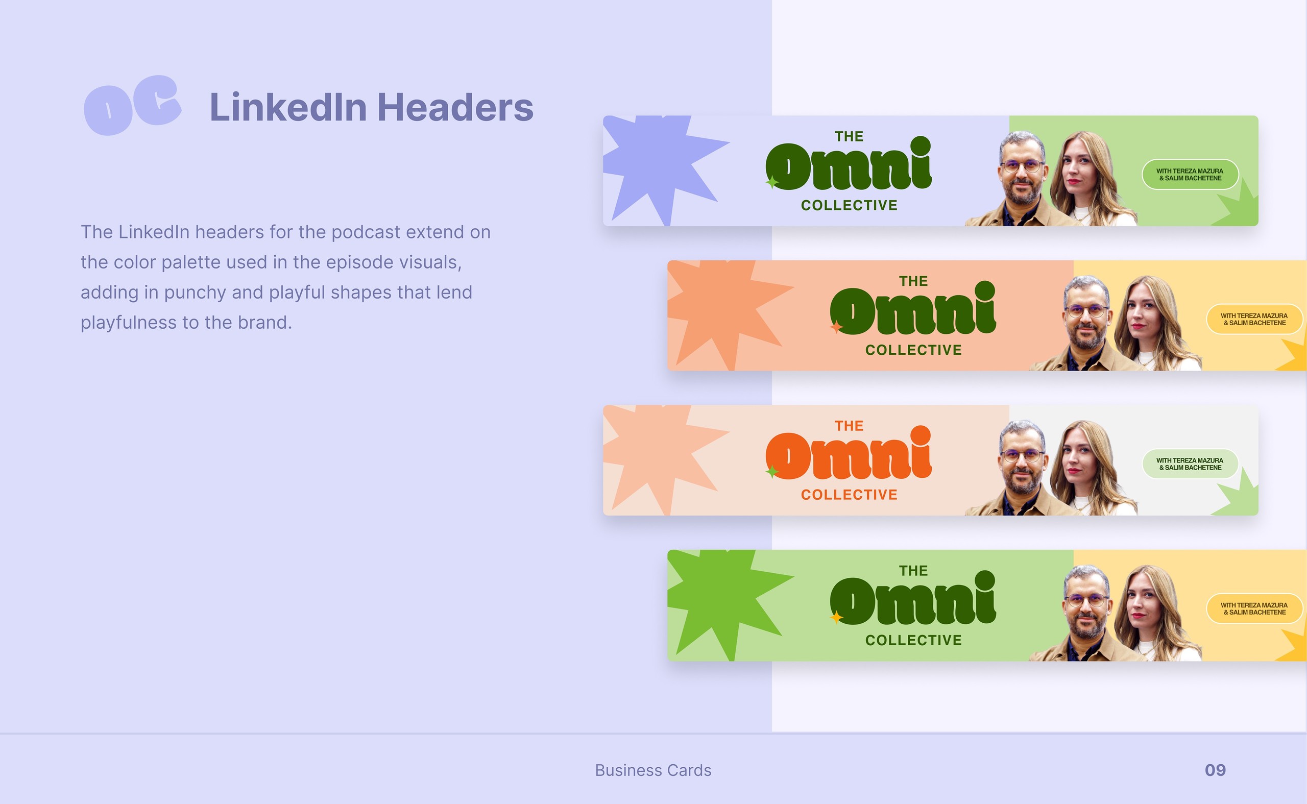
Episode covers use the full palette with complementary or contrasting text, and the LinkedIn headers add star shapes.
Process
I designed and stored every asset in Figma, from the first logo sketches to the final visuals.
Takeaway
I love the end result. It took time and plenty of experimenting with the stakeholders to find what they wanted, but the final brand creates exactly the effect we were after.