
Brand & web · 2020–2025
From Data Impact to NIQ
Between 2020 and 2025 I led Data Impact's brand through three phases: an independent startup, a co-brand after its acquisition by NielsenIQ, and finally part of NIQ's global rebrand.
- Client
- Data Impact / NIQ
- Years
- 2020–2025
- Role
- Brand & web designer
- Scope
- Brand, web, icons, templates







Overview
From 2020 to 2025 I led Data Impact's brand through every stage of its transition. A lot of it was stakeholder management, and making sure the original brand's spirit survived each change.
01
Independent Data Impact · 2020–2021
Phase 1
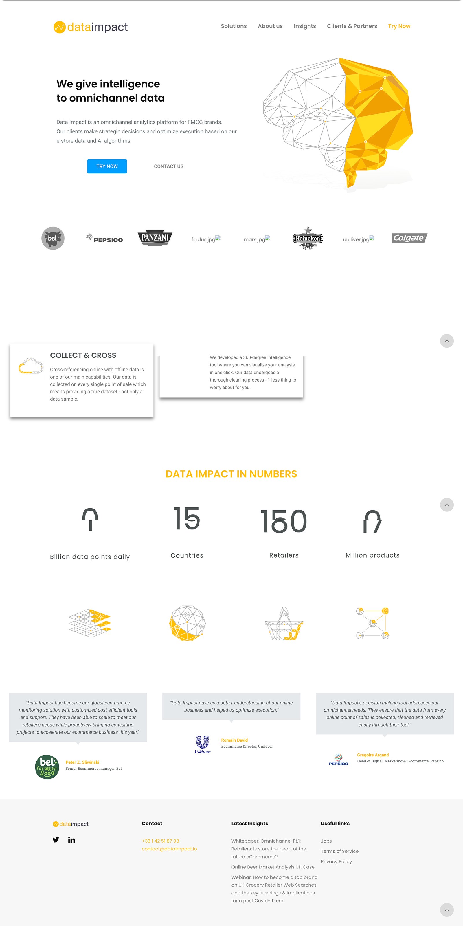
When I joined, the brand was a stark yellow and grey, with minimal, utilitarian layouts and abstract “data point” illustrations. It suited a tech-first business, but I felt it lacked the warmth clients needed to build a relationship with the brand.
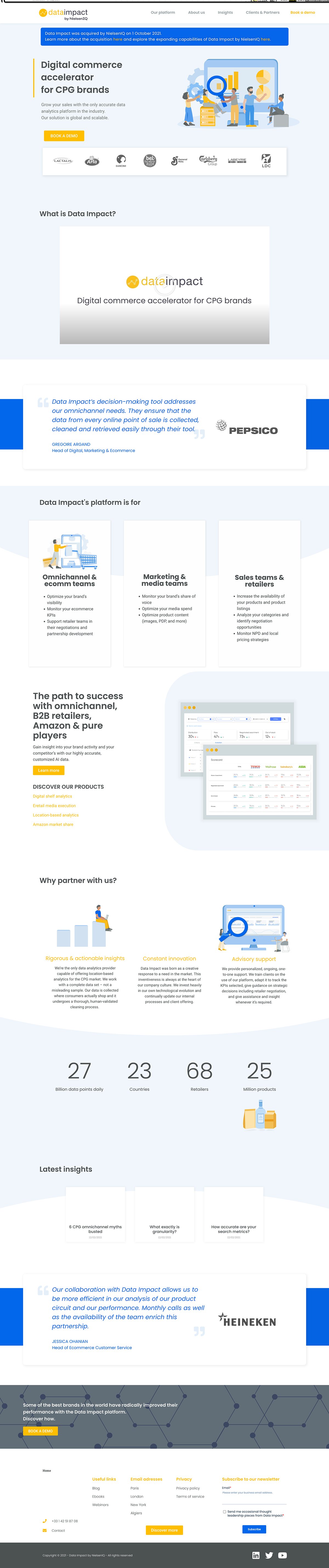
After benchmarking competitors, I gradually brought in a more human direction: illustrated figures, static and animated, that people could identify with, and deep blues that softened the brand while making it feel more credible. We kept the clarity that had earned Data Impact its early reputation.
02
Acquisition & co-branding · 2021–2023
Phase 2
NielsenIQ acquired Data Impact in October 2021. Our logo became a lockup with the NielsenIQ mark, and we had to present ourselves with more corporate structure, while fighting to keep the personality, voice and energy that had always defined us.
I guided the rollout of this hybrid identity internally, making sure client-facing and internal teams had the tools they needed. It took a lot of compromise to keep our startup voice inside a more corporate tone.
03
NIQ rebrand & full integration · 2023–2025
Phase 3
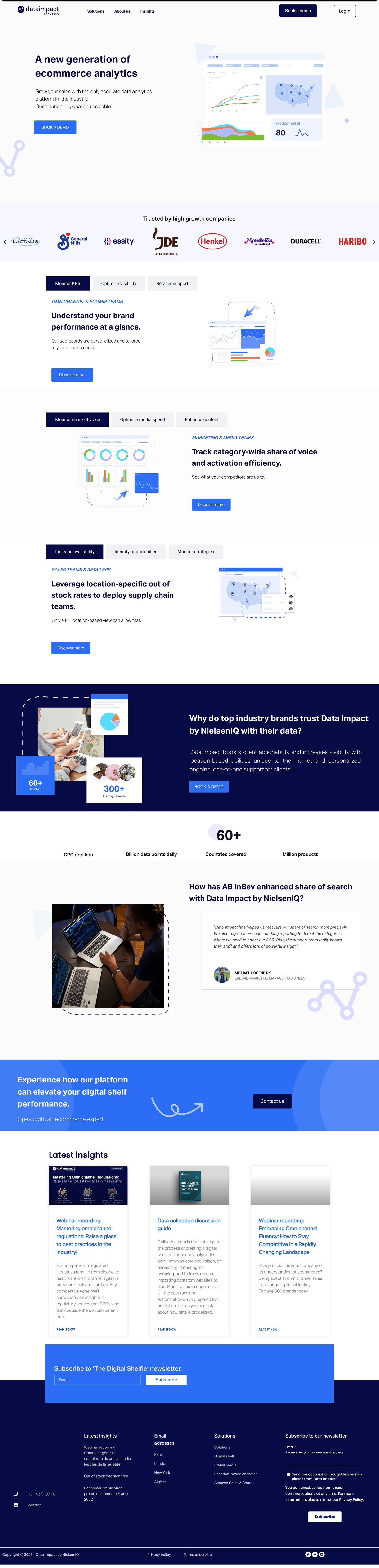
In 2023 NIQ launched its global rebrand and, ironically, it mirrored the direction we'd already been heading in: NIQ dropped its black and green for rich blues and crisp whites. That made the next transition a lot smoother than we expected.
By 2024 we had become NIQ for Digital Commerce. I led the design templates that defined how our new identity would show up everywhere, from the NIQ website and product documentation to presentations and campaigns, and our standalone site moved onto NIQ's website.

04
Icons that lasted
The icon system
A big part of the 2021 refresh was an icon system I created as a student designer stepping into a complex tech space. With little to draw on, I leaned into abstraction, turning e-commerce ideas like assortment, availability and product visibility into simple visual metaphors instead of literal pictures.
NIQ's icon library has grown a lot since then, but many of those original shapes and ideas made it into the system. The pairs at the top of this page show a few of them.
Challenges
Continuity: the first refresh was deliberately gradual so we wouldn't alienate longtime clients. Reliability and familiarity were non-negotiable.
Protecting the soul of the brand: the founders were adamant that Data Impact's tone, youthfulness and dynamism shouldn't be lost, and I agreed. From typography to the tone of voice in our templates, the brand team and I kept pushing for it.
Outcome
This was a five-year visual and cultural integration, not just a name change. NIQ for Digital Commerce now sits inside a global masterbrand, but it still has a lot of the freshness and personality Data Impact started with, because we fought to keep it.