
Case study · Editorial
The Digital Shelfie newsletter
A redesign of NIQ for Digital Commerce's monthly newsletter, so it looks like an editorial piece rather than a corporate update.
- Client
- NIQ for Digital Commerce
- Year
- 2025
- Role
- Lead designer & illustrator
- Scope
- Identity, email templates, illustration

Overview
The Digital Shelfie is NIQ for Digital Commerce's monthly newsletter about trends, insights and innovation in e-commerce and the digital shelf. After the move to NIQ, it needed a visual identity that matched the expertise, clarity and energy of its content. I led the rebrand and visual refresh.
Goals
An identity that fits the wider NIQ brand but has its own, slightly more playful tone.
- Clearer hierarchy and readability on mobile and desktop.
- More engagement through editorial-style visuals and consistent branding.
- Faster production with reusable, modular templates.
01
Audit & identity
Audit
I audited the visuals and content of past issues and benchmarked them against industry newsletters. The main problems were inconsistent formatting and poor readability.
The new system is modular, built on bold type, clean grids and subtle digital motifs. Colours follow NIQ's global guidelines, with added contrast and vibrancy so headlines and calls to action stand out.

02
Template system
Templates
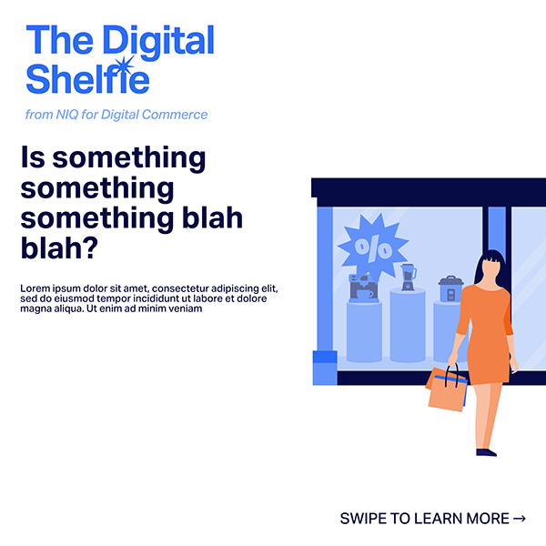
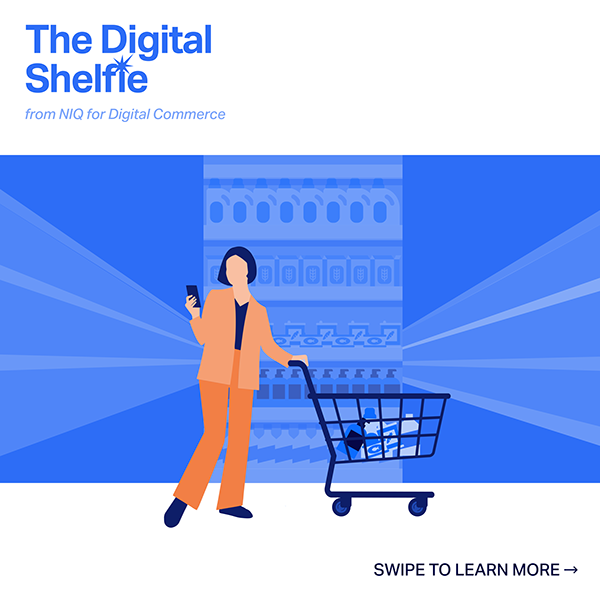
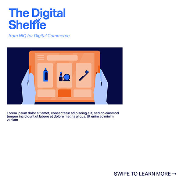
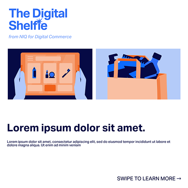
I designed responsive email templates with flexible sections for features, data highlights and calls to action, plus a library of illustrations and graphics to keep issues consistent. The same pieces extend to social posts promoting each issue.

Outcome
The newsletter now has a recognisable look, and the templates became a reference for other internal communications.