Branding case study
Badoo rebrand
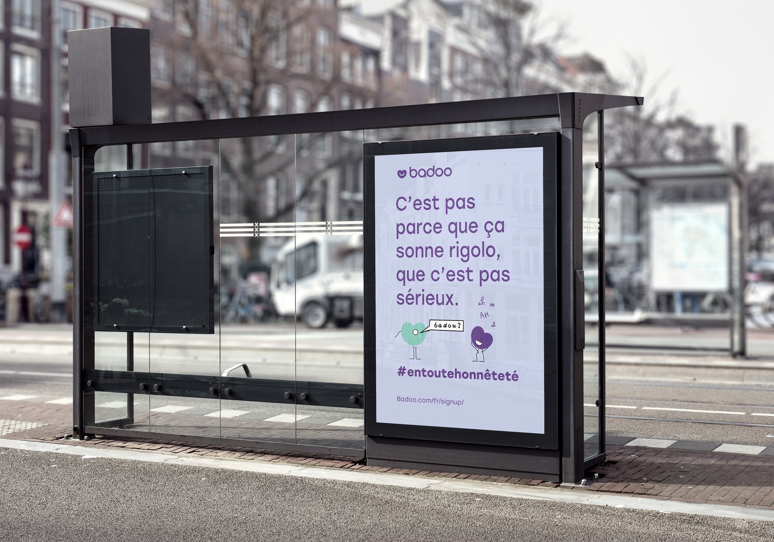
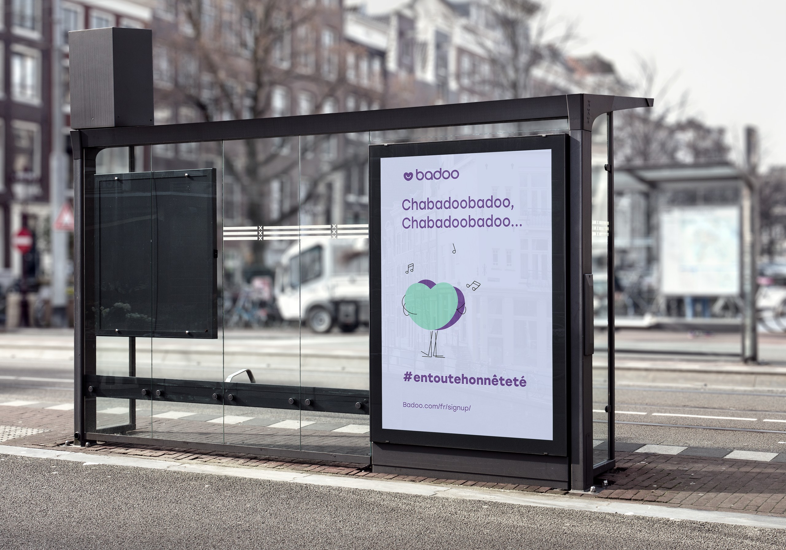
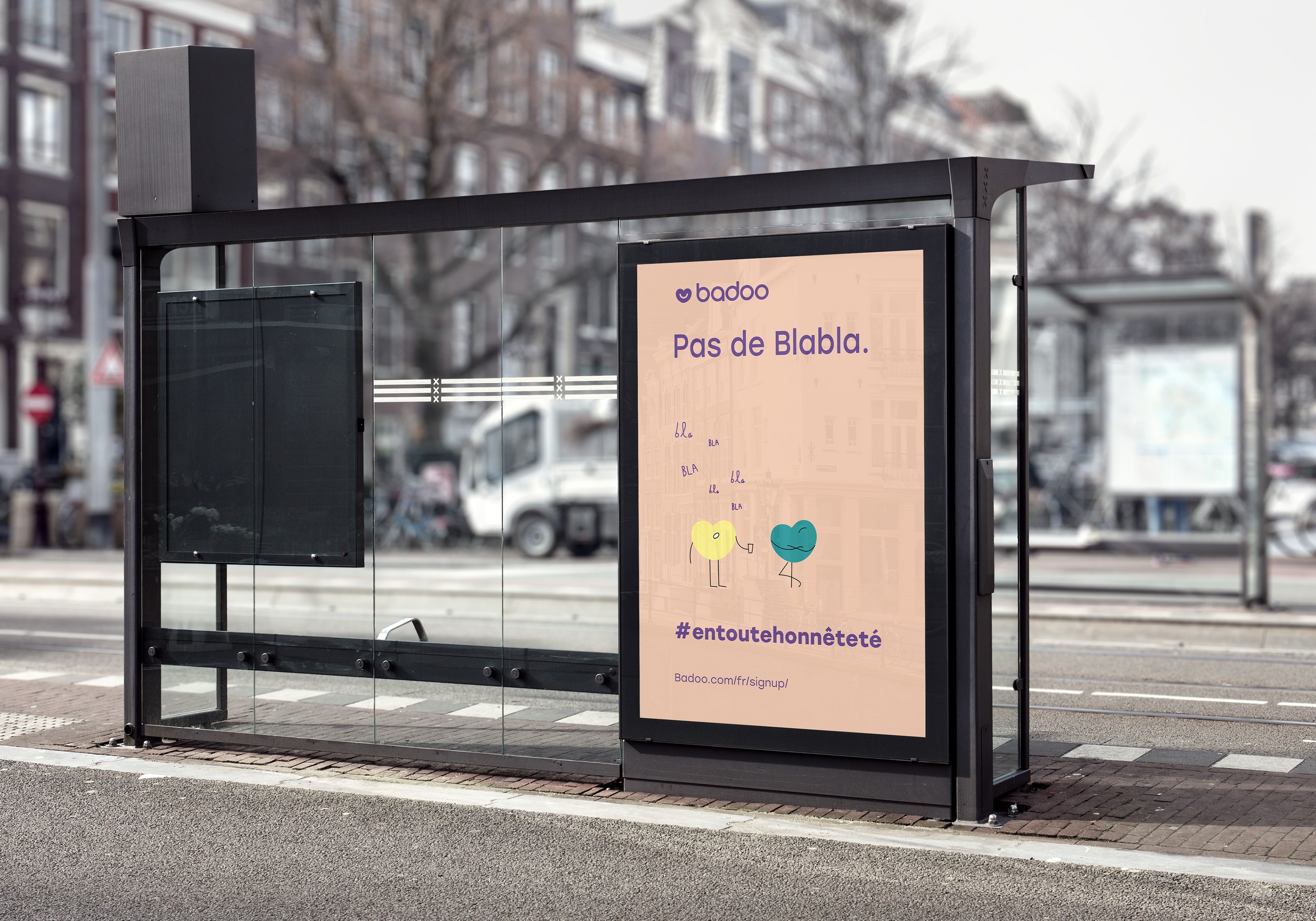
Visual assets for a rebrand pitch to Badoo, aimed at young people in rural France, with the tagline #entoutehonnêteté (“in all honesty”).
- Client
- Pitch to Badoo
- Year
- 2020
- Role
- Designer & illustrator
- Tools
- Adobe Illustrator
The brief
My client was preparing a marketing pitch for Badoo, so the visuals came paired with a strategy and concept proposal. The idea was to help Badoo move away from its reputation as a hookup app, towards dating apps like Bumble, Meetic and Hinge.
Most dating apps target people in big cities. We wrote a brief around young people in rural France instead, whose experience of online dating can be very different, and how Badoo could be a more honest, welcoming place for them.
01
Identity
Colour & type
Alongside Badoo's purple, we chose soft mint, peach, apricot and lilac: playful, but not overly feminine, to keep the audience as wide as possible.



02
Characters
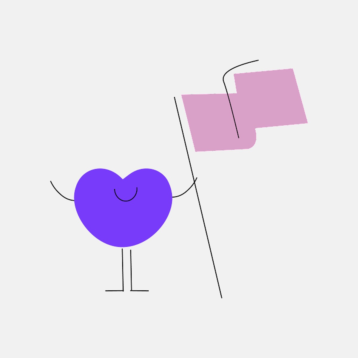
Personified hearts
Badoo's heart was already a character. I expanded it and pushed it further, giving each heart its own personality (a bit like the M&M's) to make it more playful.
They can show everything from a first spark of interest to a real connection, and give people something to identify with.

03
The campaign
Bus shelters
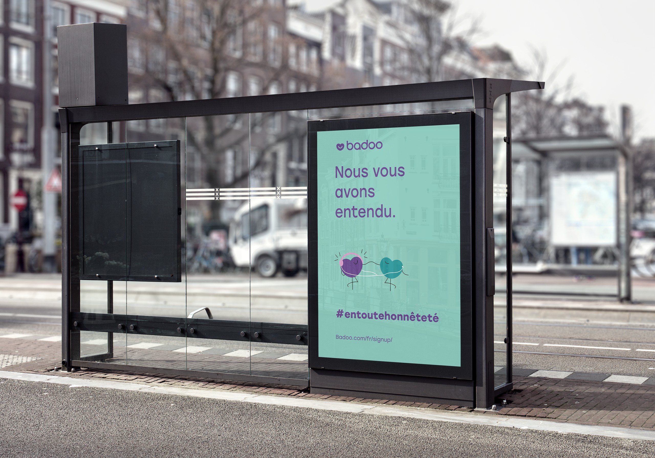
The campaign was designed for rural settings, to encourage people in smaller towns and villages to try dating apps like Badoo, so the posters are shown where they'd actually be seen: in bus shelters.
Each one pairs a short line with one of the heart characters.
Process
I made all the assets and illustrations in Adobe Illustrator, and delivered them as SVGs in PowerPoint for the client's pitch.
Takeaway
Designing for an audience most dating apps overlook made this project more interesting to me. It's one of the first projects where I worked on the strategy as much as the visuals.